# 面试官:元素水平垂直居中的方法有哪些?如果元素不定宽高呢?
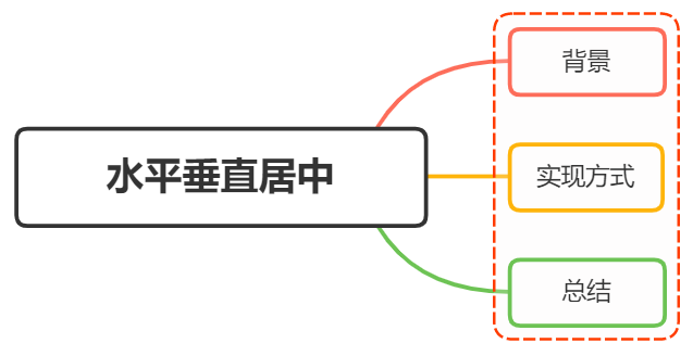
# 一、背景
在开发中经常遇到这个问题,即让某个元素的内容在水平和垂直方向上都居中,内容不仅限于文字,可能是图片或其他元素
居中是一个非常基础但又是非常重要的应用场景,实现居中的方法存在很多,可以将这些方法分成两个大类:
- 居中元素(子元素)的宽高已知
- 居中元素宽高未知
# 二、实现方式
实现元素水平垂直居中的方式:
利用定位+margin:auto
利用定位+margin:负值
利用定位+transform
table布局
flex布局
grid布局
# 利用定位+margin:auto
先上代码:
<style>
    .father{
        width:500px;
        height:300px;
        border:1px solid #0a3b98;
        position: relative;
    }
    .son{
        width:100px;
        height:40px;
        background: #f0a238;
        position: absolute;
        top:0;
        left:0;
        right:0;
        bottom:0;
        margin:auto;
    }
</style>
<div class="father">
    <div class="son"></div>
</div>
2
3
4
5
6
7
8
9
10
11
12
13
14
15
16
17
18
19
20
21
22
父级设置为相对定位,子级绝对定位 ,并且四个定位属性的值都设置了0,那么这时候如果子级没有设置宽高,则会被拉开到和父级一样宽高
这里子元素设置了宽高,所以宽高会按照我们的设置来显示,但是实际上子级的虚拟占位已经撑满了整个父级,这时候再给它一个margin:auto它就可以上下左右都居中了
# 利用定位+margin:负值
绝大多数情况下,设置父元素为相对定位, 子元素移动自身50%实现水平垂直居中
<style>
    .father {
        position: relative;
        width: 200px;
        height: 200px;
        background: skyblue;
    }
    .son {
        position: absolute;
        top: 50%;
        left: 50%;
        margin-left:-50px;
        margin-top:-50px;
        width: 100px;
        height: 100px;
        background: red;
    }
</style>
<div class="father">
    <div class="son"></div>
</div>
2
3
4
5
6
7
8
9
10
11
12
13
14
15
16
17
18
19
20
21
整个实现思路如下图所示:
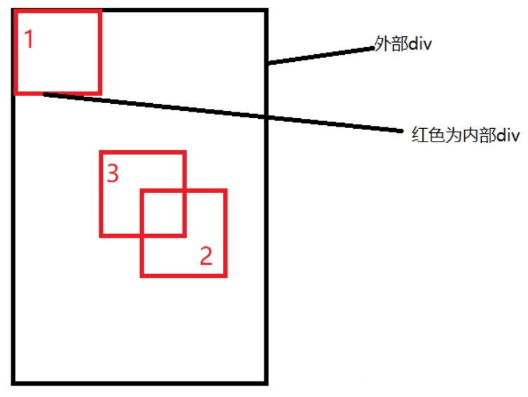
- 初始位置为方块1的位置
- 当设置left、top为50%的时候,内部子元素为方块2的位置
- 设置margin为负数时,使内部子元素到方块3的位置,即中间位置
这种方案不要求父元素的高度,也就是即使父元素的高度变化了,仍然可以保持在父元素的垂直居中位置,水平方向上是一样的操作
但是该方案需要知道子元素自身的宽高,但是我们可以通过下面transform属性进行移动
# 利用定位+transform
实现代码如下:
<style>
    .father {
        position: relative;
        width: 200px;
        height: 200px;
        background: skyblue;
    }
    .son {
        position: absolute;
        top: 50%;
        left: 50%;
        transform: translate(-50%,-50%);
        width: 100px;
        height: 100px;
        background: red;
    }
</style>
<div class="father">
    <div class="son"></div>
</div>
2
3
4
5
6
7
8
9
10
11
12
13
14
15
16
17
18
19
20
translate(-50%, -50%)将会将元素位移自己宽度和高度的-50%
这种方法其实和最上面被否定掉的margin负值用法一样,可以说是margin负值的替代方案,并不需要知道自身元素的宽高
# table布局
设置父元素为display:table-cell,子元素设置 display: inline-block。利用vertical和text-align可以让所有的行内块级元素水平垂直居中
<style>
    .father {
        display: table-cell;
        width: 200px;
        height: 200px;
        background: skyblue;
        vertical-align: middle;
        text-align: center;
    }
    .son {
        display: inline-block;
        width: 100px;
        height: 100px;
        background: red;
    }
</style>
<div class="father">
    <div class="son"></div>
</div>
2
3
4
5
6
7
8
9
10
11
12
13
14
15
16
17
18
19
# flex弹性布局
还是看看实现的整体代码:
<style>
    .father {
        display: flex;
        justify-content: center;
        align-items: center;
        width: 200px;
        height: 200px;
        background: skyblue;
    }
    .son {
        width: 100px;
        height: 100px;
        background: red;
    }
</style>
<div class="father">
    <div class="son"></div>
</div>
2
3
4
5
6
7
8
9
10
11
12
13
14
15
16
17
18
css3中了flex布局,可以非常简单实现垂直水平居中
这里可以简单看看flex布局的关键属性作用:
display: flex时,表示该容器内部的元素将按照flex进行布局
align-items: center表示这些元素将相对于本容器水平居中
justify-content: center也是同样的道理垂直居中
# grid网格布局
<style>
    .father {
            display: grid;
            align-items:center;
            justify-content: center;
            width: 200px;
            height: 200px;
            background: skyblue;

        }
        .son {
            width: 10px;
            height: 10px;
            border: 1px solid red
        }
</style>
<div class="father">
    <div class="son"></div>
</div>
2
3
4
5
6
7
8
9
10
11
12
13
14
15
16
17
18
19
这里看到,gird网格布局和flex弹性布局都简单粗暴
# 小结
上述方法中,不知道元素宽高大小仍能实现水平垂直居中的方法有:
- 利用定位+margin:auto
- 利用定位+transform
- flex布局
- grid布局
# 三、总结
根据元素标签的性质,可以分为:
- 内联元素居中布局
- 块级元素居中布局
# 内联元素居中布局
水平居中
- 行内元素可设置:text-align: center
- flex布局设置父元素:display: flex; justify-content: center
垂直居中
- 单行文本父元素确认高度:height === line-height
- 多行文本父元素确认高度:display: table-cell; vertical-align: middle
# 块级元素居中布局
水平居中
- 定宽: margin: 0 auto
- 绝对定位+left:50%+margin:负自身一半
垂直居中
- position: absolute设置left、top、margin-left、margin-top(定高)
- display: table-cell
- transform: translate(x, y)
- flex(不定高,不定宽)
- grid(不定高,不定宽),兼容性相对比较差
# 参考文献
- https://juejin.cn/post/6844903982960214029#heading-10